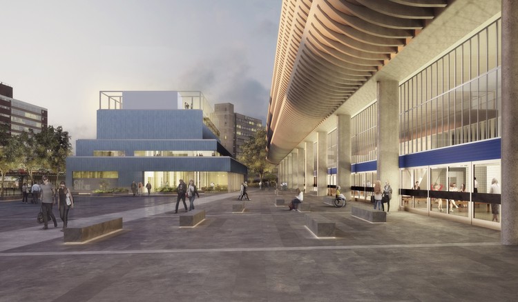
John Puttick Associates' competition-winning scheme for the Youth Zone neighboring the Preston Bus Station has undergone a major design change, opting for a standalone structure instead of one that directly connects to the station building. “The [Youth Zone] combines the lightness of a pavilion-like design with the gravitas required of any building with a significant community role constructed adjacent to the powerful forms of the Bus Station,” say the architects.
The station building, designed by BDP and completed in 1969, is now a Grade II listed structure. The new design of the Youth Zone seeks to preserve original BDP strategy, creating a spatial unity with satellite structures, what the architects call “a sequence of sculptural objects adjacent to the main [station] building.” The 2,600 square meter (28,000 square foot) Youth Zone will provide sports, arts, and performance spaces to young people in Preston.

“One of our key objectives has been to design a building maximizing available public space in and around the Bus Station, to create a major new square for Preston, says John Puttick. “This supports the civic quality of the project. It has also been important to respond to the proudly utilitarian quality of Preston Bus Station by designing a new neighbour that shares and celebrates this robustness.”

The revised design of John Puttick Associates is a terraced building meant to create a unity between the Youth Zone and the Bus Station, along with the new public space to which they are both facing. By creating a standalone structure, the Youth Zone also preserves the oblique long views of the Station facade and the dramatic concrete curvatures of the extending floor plates. The Youth Zone will further distinguish itself through a rectilinear facade of glazed surfaces, allowing for the public to view the activities occurring within. The new plan is also less technically complex and more affordable than the original design put forth by John Puttick Associates.

The office will also be responsible for the refurbishment of the Bus Station, which is in good condition. The main objective of this portion of the project will be reducing visual clutter in the station, restoring the building’s original color palette, and reintroducing the Helvetica typeface for signage. A consolidation of station entry points will add emphasis to the building’s main hall and will improve the sense of orientation and flow within the building. Given the historic significance of the project, John Puttick Associates has worked with Historic England and The Twentieth Century Society.


